PAIN COMMUNICATION
Information Design, Motion Graphics, & User Testing
Although this started off as a broad focus of addressing how people communicate physical pain, the main objective of this project was to explore how design can be used as a tool to make meaningful differences within current problems.

INITIAL BRAINSTORM
To begin our brainstorming, we asked ourselves:
"How do you describe physical pain?"
With my partner, we quickly identified some main issues to this question:
-
There is no universal written or visual language for pain
Everyone experiences pain differently, so one person's way of talking about pain may not work for others. -
1-to-10 Pain Scale
Of the current methods used today, the 1-to-10 Pain Scale is typically used to communicate a patient's pain. However, this generalizes pain as an overall binary measurement when one's pain may actually lie within multiple spectrums. -
Skewed pain communication = Skewed health diagnoses
Everyone's pain experiences are unique, so using standardized scales to communicate it to doctors could lead to incorrect pain analysis and therefore an inaccurate or faulty health diagnosis.
From this, we wanted to design something to improve the pain communiction process between patients and doctors.
FINISHED SURVEY
After doing research, narrowing down our main goal, and prototyping, our final result became a pain survey with three parts that we administered to user-testing participants:
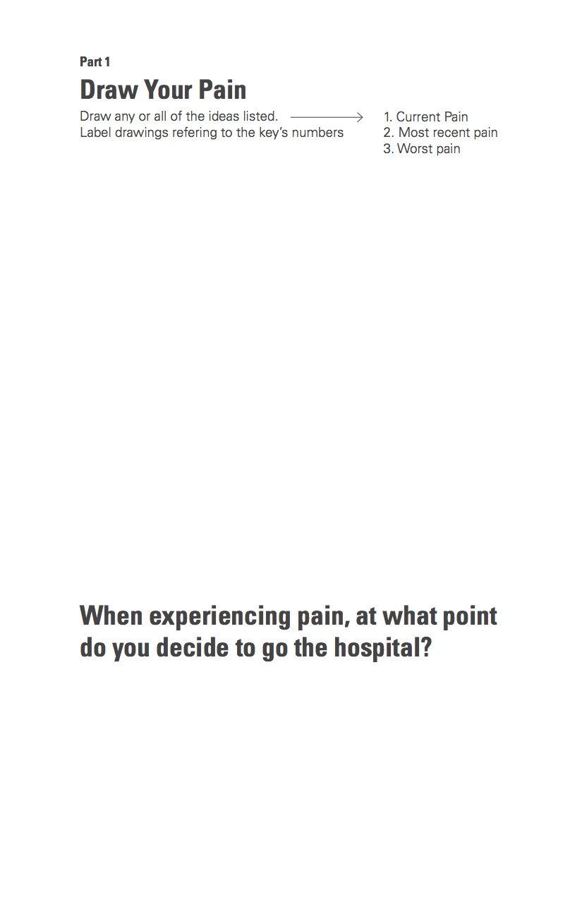
PART I: Artistic Interpretation of Pain
Participants were asked to recall and draw their current, most recent, and/or worst physical pain experience. Each drawing was subjective to their own experience, giving us a better understanding of how they perceive pain.

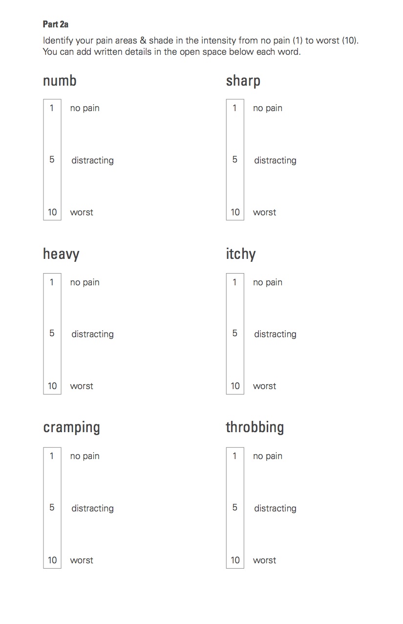
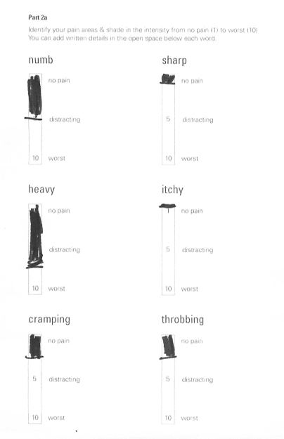
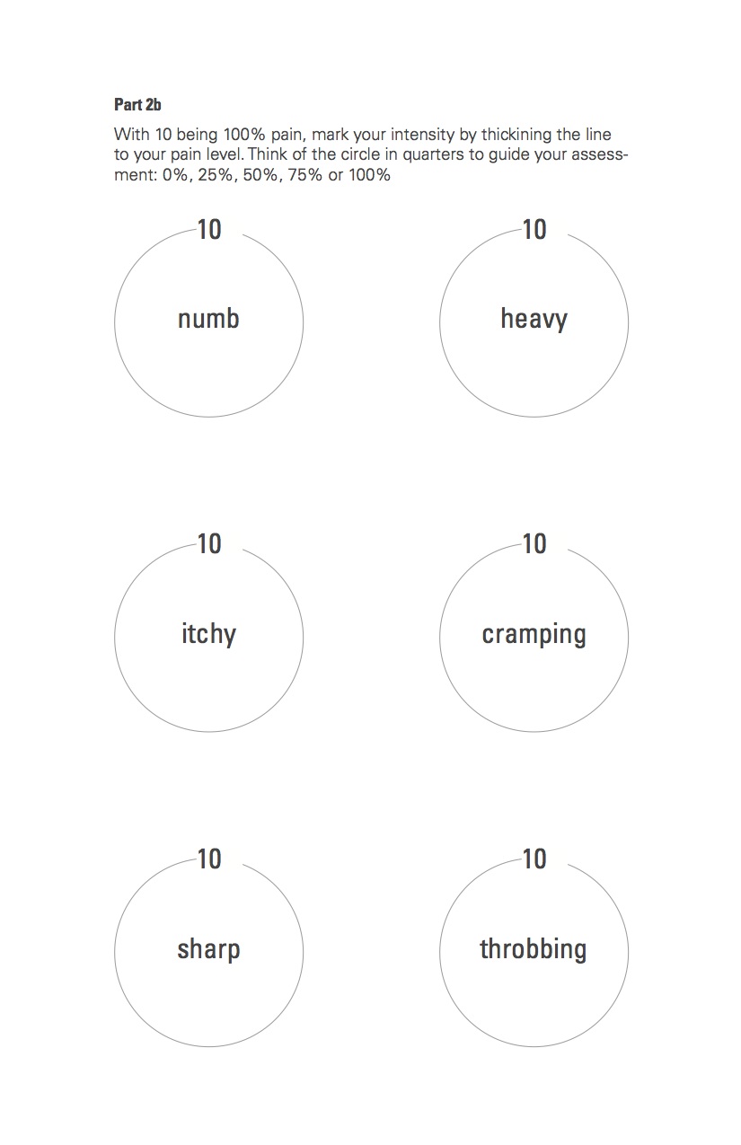
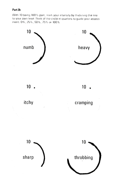
PART II: Printed Measurement Scales
Based on one of their three pain experiences from PART I, participants used all six preselected words to measure their overall pain experience. Two versions of the same scale (vertical & circular) were provided to encourage different ways of thinking about and measuring their pain.
PART III: Digital Animation Measurement Scales
Ten-second videos of each of the six words that animate the text to show pain intensity. Participants will have to move and pause the time marker to have all words visually represent their overall pain experience.
Although we provided general directions for all three portions, it was important for us as the surveyors to provide minimum guidance to ensure accurate, unbiased, and unique test results from each individual.
SURVEY FINDINGS
After follow-up questions and survey analysis, my partner and I received nothing but positive feedback from our participants and peers. Here were our findings:
- The Artistic Interpretation section helped participants think freely and produce raw representations of their pain without inhibition.
- Some participants said that having a preset of words helped them describe what they were feeling, but others wanted different words to help them even more.
- Participants found the animated representations of pain useful when they weren't able to describe it in words.
- The scales provided in the printed and animated versions helped participants pinpoint their pain in detail.
Our final survey was still limited in terms of number of pain words, number of visual representations of each word, and amount of surveys we administered — these are steps that can always be made to the survey itself and will eventually evolve while we continue further surveying.
However, this overall project of helping our participants think and perceive their own physical pain made us understand design not only as a final product, but as a communication process as well.
Full process book here: Pain Communication Process Book