A FEVER YOU CAN'T SWEAT OUT
Illustration
I always liked making album cover art and I’m a huge nerd when it comes to making sure every song in my iTunes library has album art. One of my all-time favorite bands is Panic! At The Disco ever since I listened to their first album A Fever You Can’t Sweat Out.

From their obnoxiously long song titles to every single complex lyric that managed to stick to my memory throughout the past decade, this album always had something new to discover whenever I listened to it. I looked more into the meanings of each song and figured that this album would make a great album cover project. Rather than creating one cover, I wanted to learn more about each song and create an album cover series for each of the tracks.
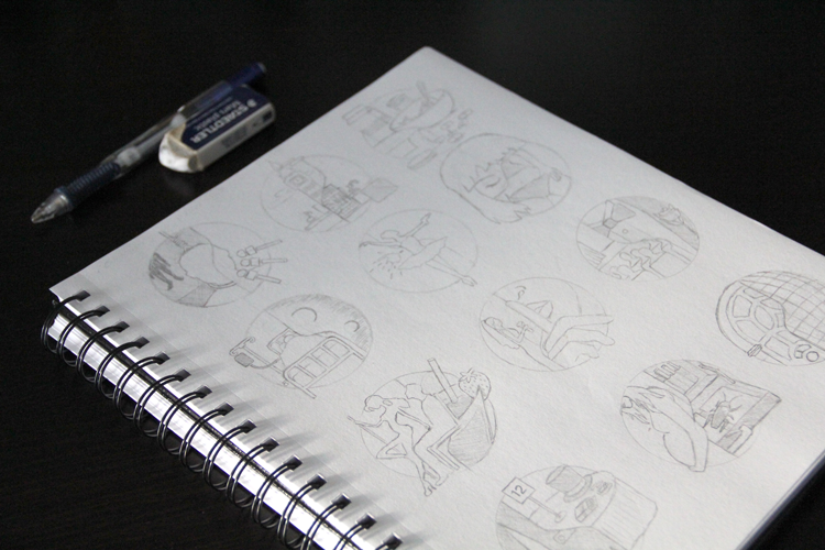
I aimed for a flat geometric/icon look that didn’t require too many anchor points and handles that go in all kinds of directions, but with a bit more illustrative freedom that allowed for more organic forms as well. I also liked the idea of using a circle frame for each song, similar to the Circle Challenge that everyone had to do in their first art/design class.

“Ladies and gentlemen, we proudly present, a picturesque score of passing fantasy”
After gradually tracing, pen tooling, adjusting handles, and selecting color combinations, all while Panic! played in the background — here is how my album cover series for A Fever You Can’t Sweat Out turned out. With almost ten years of listening since it’s debut and more hours of looking into each song lyric, it’s was fun finding new meanings in each song and figuring out how to represent each one visually.